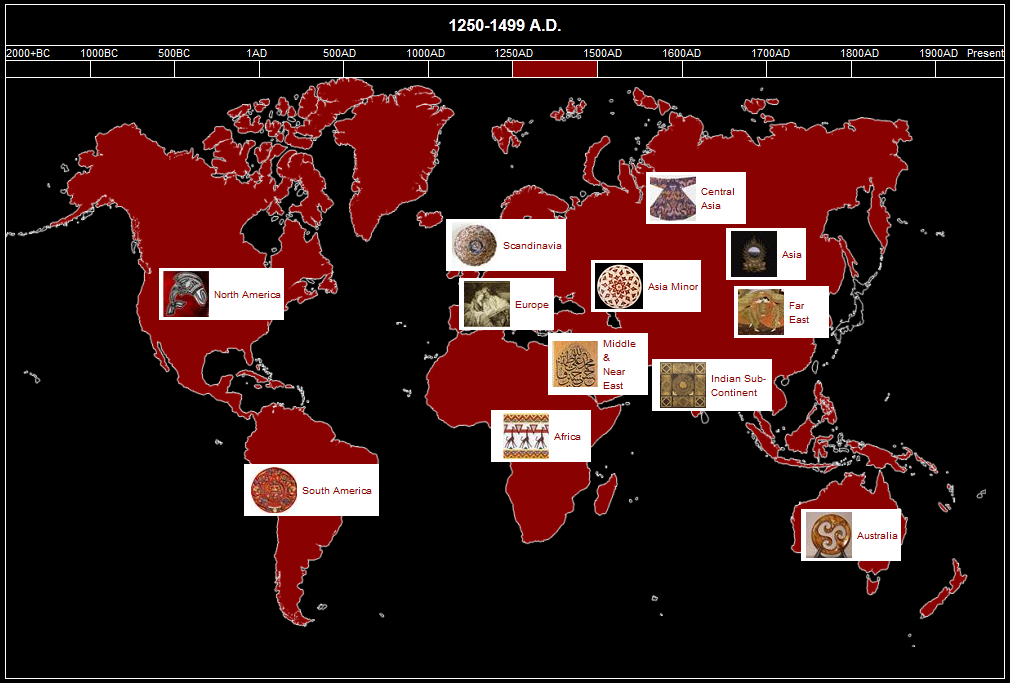
Further to the email some of our users would have received, we will this week start rolling out the Interactive Timeline to several accounts, with others to follow in the next week or so.
The Interactive Timeline Feature is another way to visualize and interact with your collection on a timeline and map. Whilst you will see a simplified but functional version of the timeline in your Vesica Dashboard, in the future there will be a more visitor interactive version of the timeline deployed on all Vesica galleries with a view to making the galleries a more engaging, interactive and educational tool for museums.
The Interactive Timeline in Vesica is inspired by the Helibrunn Timeline developed by the Metropolitan Museum in New York.
Using the Timeline is easy – you simply select the appropriate period and the map reloads. Hovering over each region will show you the number and types of objects available from that period in the region. Clicking on any of the displayed results will bring up details of the objects.
We’ll be publishing more details on the planned enhancement of the Vesica Timeline in the near future – in the mean time, here is a screenshot of what many of you will start seeing in your Dashboard under the “Charts” link on the menu.


